How Studies Use Statistics, For People Who Don't Like Math
or "What the heck is a p-value anyway?"
So statistics is a big intimidating field of study, and a lot of people either never had need to learn about it or actively went out of their way to avoid it because it gets into hard-to-conceptualize math really quickly. Even in Statistics class, a room filled with people who genuinely enjoy (or at least want to pursue) statistics, there were cases where the professor just had to go, "listen, just go ahead and plug the numbers into this equation, and you'll get the 3rd out of 6 abstract variables that you need."
So if you never tried to get into statistics beyond maybe memorizing the difference between mean, median and mode, I totally get it.
But at the same time, statistics are how we interpret the data from scientific studies, which we are exposed to constantly! And also, I just think the fundamentals are really neat, and I think even people who aren't math-inclined might think they're neat too. And like, maybe there's someone out there who wondered, "what does 'statistically significant' actually mean" and maybe, if they were lucky, got as far as glancing at the Wikipedia page for p-value before giving up.
Well, here's the one sentence answer: "statistically significant" basically means "you can't look me in the eye and tell me these results happened randomly."
Backing up a little bit. A really common question is, "Are these two (or more) groups actually different in some specific way?"
- "Do people who drink Coke experience more satisfaction than people who drink Pepsi?"
- "Do patients who were given our new medicine recover faster than patients who were given a sugar pill?"
- "Do people who meditate experience less stress?"
So at a minimum, you have two things:
- A criteria for sorting your subjects into two groups.
- A measurement you're taking of your subjects.
(You can obviously have more groups and more measurements, but let's keep it simple for now.)
When we talk about statistical significance, what we're really asking is, "Does our criteria really matter, when it comes to the measured value?"
Sometimes that's obvious, and you don't need math for it! For example, suppose I want to answer the question, "Do pigs have more legs than chickens?" To attempt to answer this question, I survey 10 random pigs and 10 random chickens, with the following results:
| # of legs | ||||||||||
| Pigs | 4 | 4 | 4 | 4 | 4 | 4 | 4 | 4 | 4 | 4 |
| Chickens | 2 | 2 | 2 | 2 | 2 | 2 | 2 | 2 | 2 | 2 |
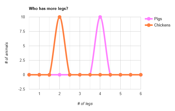
And just for fun, let's see what that looks like visually, with a bad but funny graph:

It's pretty clear that we're actually looking at two distinct groups. No math needed here: it's obvious enough through intuition that the criteria of "species" correlated with the measurement of "number of legs," at least for the species chosen.
Let's try something less trivial. What if I think left-handed people are better at hula-hooping than right-handed people? To try to prove it, I get 10 random people of each handedness and give each of them one chance to hula-hoop for as long as they can, measuring the result in seconds (and rounding down because I'm lazy).
Twenty hula-hooping trials later, I get the following results:
| hula-hooping duration (seconds) | ||||||||||
| Left-Handers | 22 | 8 | 19 | 9 | 12 | 9 | 15 | 21 | 15 | 15 |
| Right-Handers | 14 | 13 | 10 | 9 | 12 | 13 | 18 | 16 | 12 | 14 |
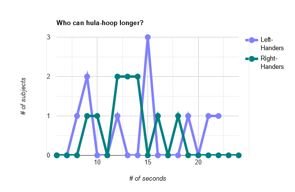
Okay. That's not as clear as the pig and chicken experiment. Maybe visually it'll be clearer?

Uh oh. That's a mess. The left-handers look like they might be slightly ahead, but the graph is way too noisy to reach any clear conclusions.
Undaunted, I press on and apply what I learned from my middle school math classes to see which group has the bigger numbers:
| Mean | Median | Mode | |
| Left-Handed | 14.5 seconds | 15 seconds | 15 seconds |
| Right-Handed | 13.1 seconds | 13 seconds | 13 seconds |
Aha! The lefties, on average, hula-hooped longer! In fact, on average, they hula-hooped for 10% longer! We win!! We win!!
So we're done, right? We've proven conclusively that left-handers are now and forever the Hula Hoop Champions. ...right?
Well, no. These results point in the direction of my hypothesis, but they aren't strong enough for me to ask other people to accept it. It's at this point that a statistician would appear and announce that my p-value is a whopping 0.22, well over the 0.05 cutoff commonly used to determine statistic significance.
Okay. What does that mean?
What that means is that my results are a bit more impressive than someone flipping two coins and calling both correctly. That's nifty, but not nifty enough to accept that this person didn't just get lucky. A p-value is just a percentage: in this case, my results were 22% likely to happen by chance, and the statistician isn't going to accept my results until that drops to 5%. Simple enough.
But, hang on: what does "22% likely to happen by chance" mean in this context? The odds of getting this exact raw data is infinitesimal! When we say a coin has a 50% chance of landing on heads, that's easy to understand: there are two outcomes, equally likely, and heads is one of those two.
But there are infinite potential results for "two groups of ten numbers each," so how did they arrive at 22%?
Here's how to think about it.
Imagine, for a second, that my hypothesis was wrong. Imagine there is no difference in hula hoop rotational sustainability that correlates with handedness. In other words, my criteria for sorting subjects into two groups might as well have been random. This is called "accepting the null hypothesis," which is a really cool phrase in my opinion.
But we did see a difference between the two groups, right? Well, sure, but differences can arise randomly. If we took the subjects and re-assigned them to two new groups, this time assigning them totally at random, we wouldn't expect the results to be identical. There's always going to be some difference.
The question is: If we did exactly that with the data I gathered, shuffling the subjects into two new groups at random, what are the odds we'd see a difference between the two new groups that was at least as strong as the difference we see now? If we replace my criteria with randomness, does the difference persist (suggesting my criteria might as well be random) or vanish (suggesting my criteria is meaningful)?
That's exactly what p-value tells us.
If you took my raw data and randomly scrambled the subjects, there's a whopping 22% chance we'd see at least a 10% difference between the two groups. On the one hand, it's encouraging for me that scrambling my data is more likely to make the observed difference weaker than it is to make it stronger. On the other hand, like the "flip two coins" guy, it's not unlikely enough that the difference would be just as big for the scientific world to accept my hypothesis.
Contrast this with the pig and chicken example: if you scrambled those results, what are the odds that you would randomly end up with a group of only 2's and a group of only 4's again? Far below 5%, that's for sure. (I believe it would be 1/219, which is about 0.0002%.)
Basically, if you want a statistician to take you seriously, your data has to be as good as being able to call when your next d20 roll will be a natural 20. And, to complete the analogy, you have to be able to do it on demand! If your experiment is repeated and doesn't see significant results, then maybe you really did just get lucky the first time.
The pig/chicken data is about as good as being able to call when my next three rolls are all going to be critical hits; whereas my hula-hoop data isn't even as exciting as being able to call when I'm going to roll at least a 16.
About That 5% Cutoff
That 5% cutoff is basically arbitrary, and not used in every case. For example, if you're considering mass distributing a new drug that might have harmful side-effects, you want to be very, very certain that it's better at treating people than a sugar pill, and thus might want to see 1% instead. There is no magical math reason that makes a 4.9% result absolute proof and a 5.1% result meaningless garbage. It's all just probability."Okay," you might ask. "But how did you arrive at that 22%?"
"I'm glad you asked," I respond, "I--"
"But you can't use math to explain it," you interrupt (rude).
"Dang!" I say, secretly relieved that you aren't going to make me try to remember the details of my college stats class.
Very basically, what we look at is how the data within each group varies, and contrast that with how the data between the groups vary. This is called the variance, which is easy enough to remember. Mathematically, low variance means most of the numbers in the set are very close to the mean average, while high variance means the numbers are all over the place.
What we are looking for, if we want statistically significant data, is low variance within the groups and high variance between the groups. ("Low" and "High" are purely relative here. I just mean we want to see more variance between groups than within them.)
Take the pig/chicken data: the variance within each group is low. Very low! In fact, it's zero. That's the lowest number there is! (It's been a while since I've taken Math, so this may not still be true). There is no variance in either group. The variance between the groups is much higher, comparatively, in that it is not zero. But even if we threw a three-legged pig or two in there, we'd still have extremely significant results.
Let's take a look at that pig/chicken graph again. No need to scroll up, I'll go fetch it for you. This is what low variance within a group vs. high variance between groups looks like:

Two tall, extremely vertical peaks (low within-group variance, as all the numbers are very close to their group's mean) separated by a wide gulf (high between-group variance, as none of the numbers are close to the mean of all the data, namely 3). This is the ideal look for trying to prove your hypothesis. It doesn't take much data to find a conclusive result if this is the shape your numbers take.
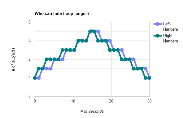
Now, pretend I ran a second study where I had a lot more people hula hoop, and the resulting graph looked like this:

Two wide, horizontal lumps (high within-group variance) with a lot of overlap (low between-group variance). This is the opposite of ideal. It's not impossible to find statistical significance with a graph like this, but you'd need a lot of data to prove one lump being a bit to the right of the other lump isn't just a fluke.
You can likewise picture other potential outcomes that fall between "ideal" and "the opposite of ideal": If you have low variance both within and between groups, you'd see two peaks lined up nearly on top of each other. If you have high variance both within and between groups, you'd see two wide lumps, but not parked right on top of each other. These are, naturally, worse than ideal but better than the opposite of ideal.
I hope this all makes some degree of intuitive sense. If each group has a bunch of values that all very much resemble each other, and very much don't resemble values from other groups, it's going to be wildly unlikely that a random shuffling will maintain that. On the other hand, if the values from each group are totally all over the place anyway, shuffling may not change the shape of the data all that much.
And so, the better our criteria is for sorting our data into neat little groups, the more we can be confident that our criteria actually matters -- or in other words, that our criteria is significant.
I think that about covers it! I'll end with a reminder about what results being statistical significant actually means: that we're reasonable confident that two groups actually differ with respect to whatever was measured. It does not tell us how much they differ by, and it tells us nothing about why they differ.
Consider the following headline: "Study shows left-handed people are better at hula-hooping than average than right-handed people."
This should immediately prompt the following questions:
- Do the subjects used represent the general population?
- Does the measurement taken actually reflect hula-hooping skill?
- Can we trust that the data was gathered in an accurate and unbiased manner?
- Can we trust the mathematical analysis is legitimate? (For example, a common method for determining p-value assumes the data has a particular, "smooth curve" shape to it -- which my initial hula hoop data did not!)
- Did the data reveal statistical significance? If it merely that one average was higher than the other, that's m
- How large was the difference? Does handedness serve as any kind of actual predictor for hula hoop skill?
And even if the answer to every single one of these questions is "yes," we have still learned nothing about the "why"! Is there some genetic factor that both causes left-handedness and improves a person's hip swivel? Is there something about the minds of left-handed people that makes them naturally inclined to practice hula-hooping? Are left-handed people encouraged to practice hula-hooping somehow in a way their right-handed peers aren't, either implicitly or explicitly?
Obviously this is all a big metaphor for people who say dumb stuff like "men are better than women at math," and then their "proof" is one particular batch of scores from a wonky test in which biological sex predicted 0.1% of a person's score.
There are a lot of ways to lie with statistics, as it turns out. Which is why it's important to understand what terms like "statistical significance" mean, and what they do not.
Thanks for reading, I hope you enjoyed it!
